Rochester Mutual Aid Network
is a 100% volunteer and community run mutual aid group in Rochester, NY. The network aims connect the community, and allow those who need food, supplies, or general assistance to get help from neighbors who have the means to provide that assistance. Aid is provided in solidarity with those in need, without judgement or shame. I developed a brand refresh for the growing organization.

Rochester Mutual Aid Network needs
Funds
Create an organic, relaxed visual language that speaks to the mission and community run + funded model. Give viewers a sense of confidence in where their money is going and motivate them to donate.
Supplies
Again, develop visuals that make the viewer comfortable donating, and instill trust in the organization as a community run effort.
Volunteers
Develop a brand voice for the organization, and create stand out visuals to raise the Rochester community’s general awareness of the group and what the group does. Reflect the fun, warm and welcoming nature of the organization to motivate volunteer sign ups, and spread the word to people who need help.
The Rochester Mutual Aid Network is structured to build and connect. Having expanded to a large network of people since March 2020, I saw lots of practical needs for the brand that could help the organization thrive and serve more people.
The Network’s core offering is food and supply assistance. They do so via sending out care packages from volunteer’s “hubs” throughout the city. The packages of food, hygiene products and cleaning supplies are then picked up by other volunteers, and delivered to their requesters around the city.
Original vs. Updated Logo
It was important to me and the organization to keep the visual symbolism of the handshake from the original logo, both for consistency, and to represent aid being given on a common ground.
Shifted to a more organic and stylized look, keeping the same boxy feel of the text, but with something more irregular and almost hand written. Additionally, established a consistent set of colors, keeping red and black throughout the system, and adding an off white.

Contact Cards
Through experience, volunteers identified the need for some sort of contact or business card for to have on hand to give to people they meet in passing who could benefit from the assistance the organization provides. These cards would serve that purpose, and allow more community members to be made aware of the resource.

Cookbook
A unique offering from the Rochester Mutual Aid Network is the Cookbook. The Cookbook is given to requesters that order care packages of food, in an effort to make requesters feel connected, and spark inspiration in the kitchen with the food they’ve just received.
In the brand refresh, I wanted to ensure some readability by spreading out some of the recipes in the layout, adding some illustrative pops, and keeping the original food photographs.
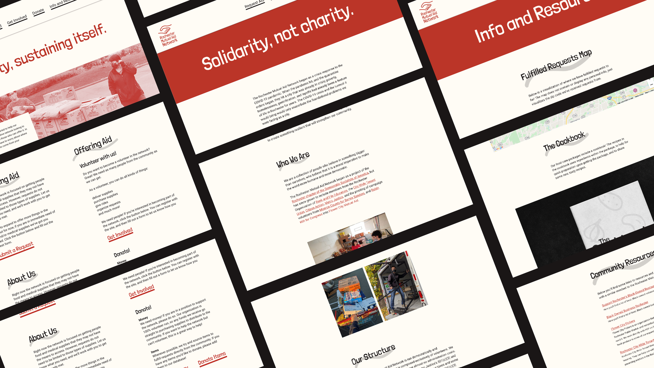
Website Design
The website acts as the point place for people to sign up to volunteer, gather more information and request aid. Because it acts as a hub for all of these things, I wanted to keep the structure simple and to the point, while including elements such as images of volunteers to give a snapshot of the organization.

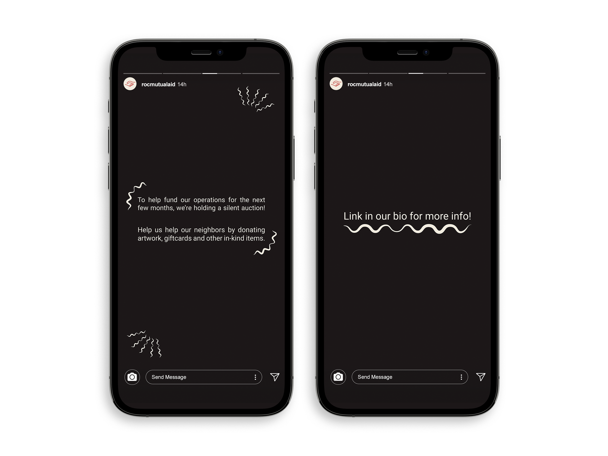
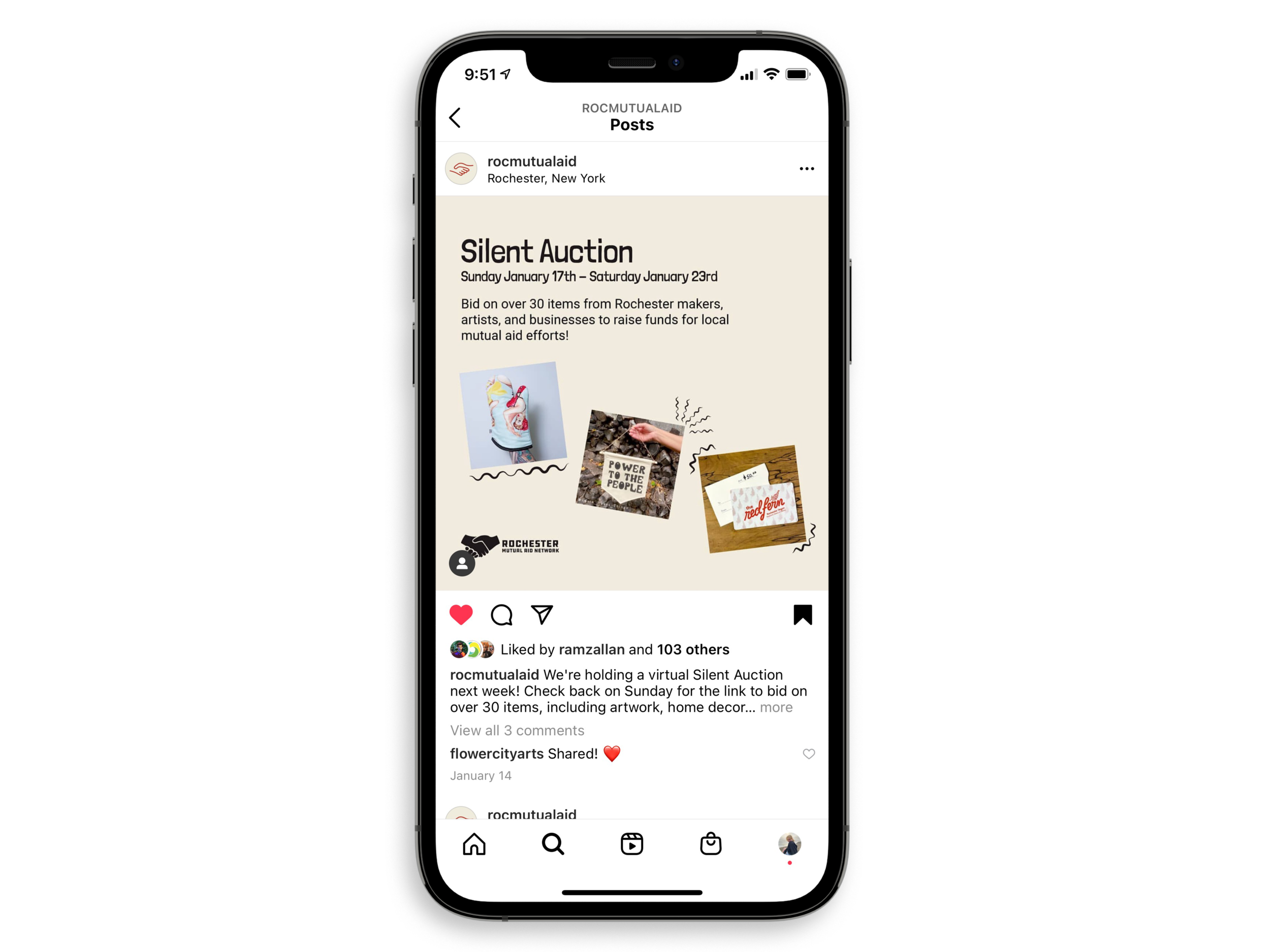
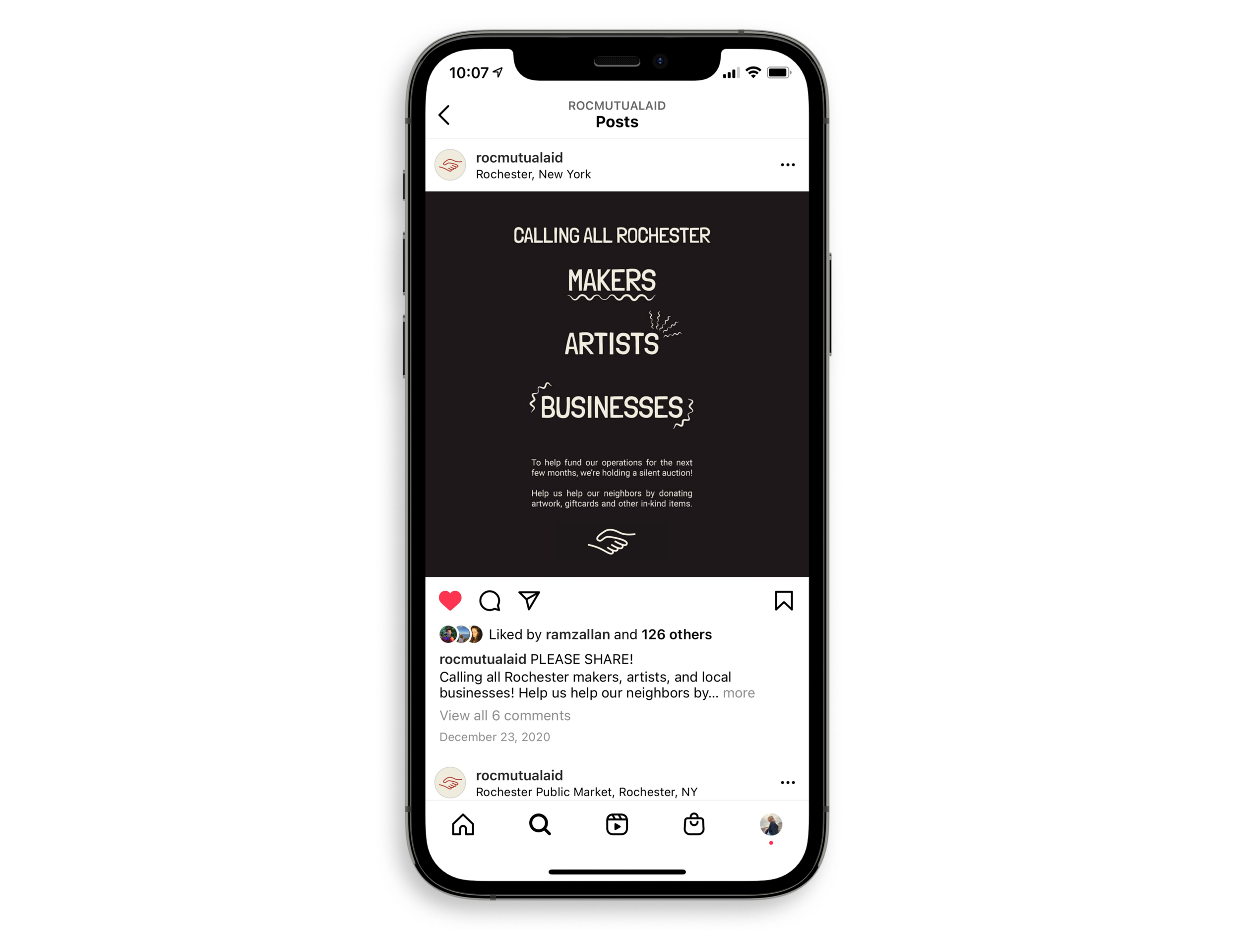
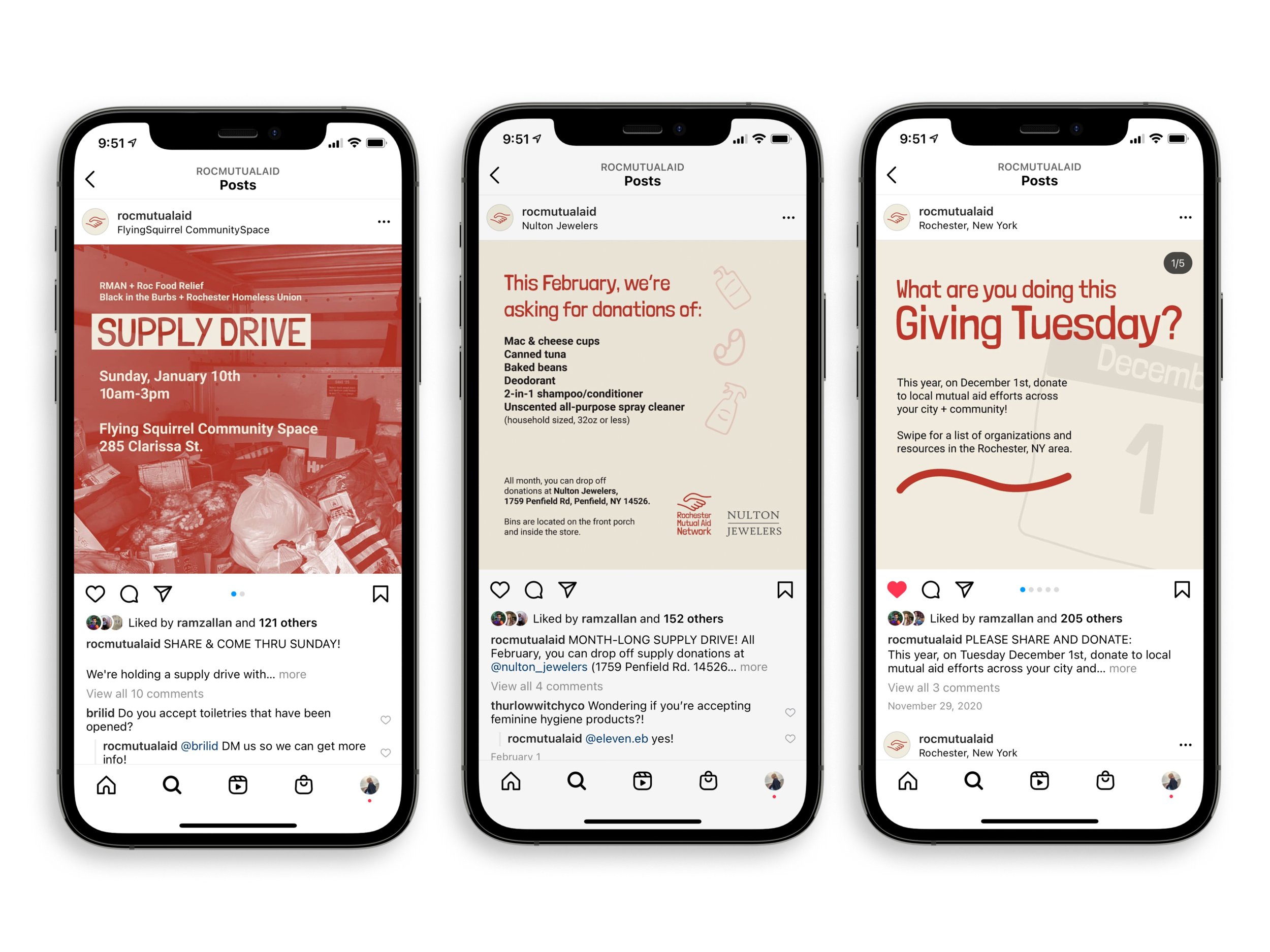
Social Media Campaigns
Social media campaigns and general posts for events, volunteer and donation pushes are a huge part of the organizations communication and messaging with the community. I developed fun, engaging social media content for the organization with the goal of pulling people in, and showing a variety of visuals.

